On this page...
What is accessibility?
All documents and web content should be easy for everyone to access. PDFs can be hard to access. Screen readers struggle with them, and navigation is tricky. PDFs are also harder to search and find with search engines like Google. Web accessibility is about making websites and tools easy for people with disabilities to use.
Back to topCreating accessible content
- Don't use e.g. Use for example or just use your examples. The reason is some older or less advanced screen readers may read e.g. as the letters E-G or the word egg, rather than expanding it to for example. It may also present a barrier for users with cognitive or learning disabilities and for those whom English is not their first language. It's recommended you don't use i.e. either.
- Rather than using double or single quotation marks for single word or phrase emphasis, use bolded text. Using quotation marks to indicate emphasis can be confusing for users with disabilities, especially those who rely on screen readers. Bold text provides a clear and consistent signal of importance and is easily understood by all users.
- To improve accessibility, it's recommended to use double quotation marks for quoted text and single marks only for quotes within quotes. This is particularly beneficial for braille transcribers, as it provides clear distinction between quoted and non-quoted text.
- Don't use italics. Use bold instead. Italics are hard to read for everyone and largely ignored by screen readers.
- Use the word and instead of using an ampersand &. The word and is universally understood. Using the symbol can be a visual speed bump that interrupts reading flow and may take more mental effort to interpret. Ampersands are not universal in all languages.
Exceptions: If it’s part of a company name such as AT&T; in a navigation menu where the word and would cause space issues. - Other punctuation. Remember that screen readers may read everything. If you use parentheses surrounding text, like (content), a screen reader may read that as left/open parenthesis content right/closing parenthesis.
- Don’t use all caps for titles or content. It reduces readability for everyone, particularly for users with cognitive disabilities. It may cause screen readers to spell out words letter-by-letter as they may see it as an acronym.
- Lists. Use built-in editor tools for bulleted or numbered lists. If you type the numbers 1, 2, 3, etc. to start the lines in your list, a screen reader will not see it as a list or related content.
- Avoid directional language that requires users to see the layout or design of the page. Avoid using below, above, right, or left when trying to direct a user to another element or link on a page.
- Don’t use em dashes, use regular dashes if necessary. Screen readers may read em dashes, which are long dashes, as dash or dash-dash. This can cause confusion when punctuation marks are announced. Use en dashes, which are regular dashes, or hyphens. Consider not using dashes when unnecessary. Instead of writing 5–7, write 5 to 7.
- Headings H2-H6 should only be used for subtitles or section headings, not paragraphs. Using a heading tag for an entire paragraph breaks screen reader navigation and confuses the content structure. Screen readers see headings as titles, subtitles, or subheadings. Drupal automatically tags the title of a page as an H1. Don't add another H1 on your webpage. When creating Word documents to be exported to PDF, be sure to style your title as an H1.
- Make calls to action accessible. Never use Click Here, Learn More, View Video or a URL. Make the text of the link a clear description of where the user is being taken. If a link text is Click Here, it is considered suspicious by Google. Link text could be View Video of Accessibility Training for MS Word, or View Video of Accessibility Training for PDFs.
- Provide useful alt text for non-text content. This helps to ensure that non-decorative images, media, applets, and other non-text content can be understood by users of assistive technologies.
- Caption your videos to ensure visitors with certain audio and cognitive/learning disabilities can enjoy your content.
- Create a document title that is unique and not a duplicate. Ensure the title make sense and is understandable.
- Do not insert extra carriage returns, tabs, or spaces to create extra white space. Use caution when doing a copy and paste from MS Word as there could be extra white space. Visually your eye can skip over extra white space, but a screen reader may be forced to read blank character or carriage returns as carriage return, carriage return.
- Plain language. Using simple plain language, steering clear of slang and abbreviations where possible, and providing definitions where it is not possible.
Why is accessibility important?
Our goal is to make our content accessible and inclusive to all readers. The W3C Web Accessibility Initiative says that web accessibility means designing websites, tools, and technologies that people with disabilities can use. It ensures that people can:
- See, understand, navigate, and use the web.
- Contribute to the web.
This includes things like good color contrast, captions for videos, the ability to use a keyboard to navigate a website, and more.
Back to topStandards
As of October 2023, the websites on the DX Platform meet these accessibility standards:
Back to topWriting in plain language
The State of Iowa Voice, Tone, and Style Guide can help you write content that is easy to understand. You can also learn more about the plain language in government initiative. Use simple plain language, steering clear of slang and abbreviations where possible, and providing definitions where it is not possible.
As you write, ask yourself these questions:
- Is this written at an 8th-grade reading level using plain language?
- Can someone easily translate this into their preferred language?
- If someone is using a screen reader, will the order of the content make sense?
- Can someone on a small device, like a smartphone, quickly understand the page?
- Is my content written at an 8th grade reading level?
Learn more about writing for all people in our style guide.
Back to topPDF editorial guidance
- Always make sure your PDFs are remediated and accessible before uploading them to the platform.
- Only use PDFs when necessary, such as for long documents that need to be shared.
Document naming conventions for accessibility
Naming files correctly is important for accessibility. Clear, consistent names help people with disabilities find and organize files.
Here’s why naming files properly matters:
- Screen reader compatibility: Screen readers use file names to help users understand what the file is. Clear names make this easier.
- Organization and findability: Using consistent naming conventions helps everyone find files quickly, especially people with disabilities.
- Search engine optimization - SEO: Descriptive file names can help improve your website’s search engine ranking.
Best practices for naming files
- Use descriptive names: Clearly describe what’s in the file.
- Avoid abbreviations and acronyms: Use full words so the file name is clear.
- Use dashes: Separate words in file names to make them easier to read.
- Be consistent: Use the same naming rules across your website.
- Prioritize important information: Put the most important words first.
- Date: Use the format YYYYMMDD to keep files in order.
- Example of a good document name:
- ProjectName-DocumentType-Date - An example would be CohortPlan-Schedule-Jan2024
For more details, check our Naming Convention Guide (380.05 KB) .pdf .
Back to topRun Acquia Optimize scans for accessibility
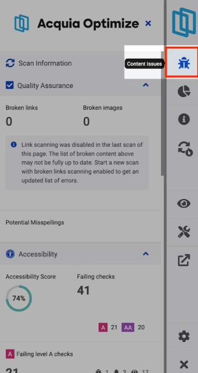
Acquia Optimize helps you find and fix accessibility issues, such as broken links and missing alt text. It also offers a Chrome extension to help you quickly identify problems on your website. Fixing these issues helps make your site more accessible and improves the user experience for everyone.
How do I improve my accessibility score with Acquia Optimize?
When to use Acquia Optimize
- Weekly audits to make sure all pages stay accessible.
- After updates to the website that might affect accessibility, like new images or changes to navigation.
- When issues are flagged, like broken links or missing alt text, that affect accessibility.
- For routine checks to find problems that may affect users with assistive technologies.
Learn more about how to run an accessibility and policy scan for your site.
Back to topMaking maps accessible and easier to understand
Use at least 10-point font. This helps make sure the text is as large as possible. When designing for accessibility, something to keep in mind is that larger is always better.
This is especially important for users with low vision or those viewing your content on mobile devices. You'll want to make sure that you choose the right type of font like Sans Serif fonts like Aptos, Calibri, or Arial.
These fonts usually work best. They're clean, easy to read, and lack decorative strokes. Those extra details can make text harder to read or blend into the background.
Map and data visualization color contrast
For color contrast, make sure your text color stands out against the background color. WCAG guidelines say normal text must have a contrast ratio of at least 4.5 to 1. This helps ensure legibility.
To achieve this, you can use tools like the Color Contrast Analyzer or Web AIMS. These tools help you check if your colors meet accessibility standards.
Here are some tips for color contrast: Avoid light text on light backgrounds and dark text on dark backgrounds. Low contrast makes reading difficult.
Watch out for color overlays and transparency effects. They can weaken contrast.
Being intentional about scale, text, and contrast helps make reading easier. It also makes your content more inclusive for everyone, no matter how they access it.
Back to top