On this page...
Purpose of Qualtrics Heatmaps
The Qualtrics Heatmap tool shows how people use your website. It lets you see where they click, where they move their mouse, and how far they scroll down the page. This helps you figure out what parts of your site people are paying attention to and what they might be missing.
Note: This feature is only available to Agency Managers.
Benefits of Creating and Using Heatmaps
The Heatmap feature is useful for:
Identify which parts of a page attract attention and which are ignored.
See how far users are scrolling on the page based on which device they are using. This helps spot gaps where information is missing or could be better placed.
Determine if page content needs to be edited due to lack of clarity by watching user's mouse hovers.
Spot if users are getting distracted from important information with the Click map feature. This can show if users are clicking on an image or text.
A key takeaway to help determine when to use the Heatmap feature is identifying what users notice, read, or click.
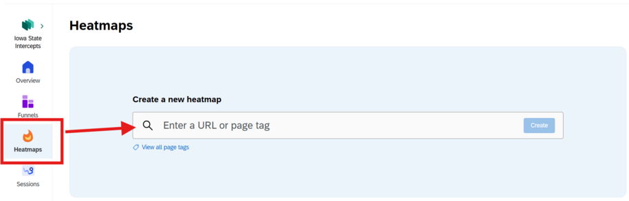
What’s Included in a Heatmap Report
Heatmaps help you understand how users interact with your website by showing where they click, scroll, and move their mouse. You can view this data by device, such as desktop or mobile, to see how behavior changes across platforms.
Click maps show where users are clicking and how often. You can also identify error clicks, dead clicks, and rage clicks which help you find broken links, confusing design elements, or signs of user frustration.
Scroll maps show how far users scroll down a page. You can view the average scroll depth, see how many users reach each section, and check whether important content is placed too low on the page.
Using Heatmaps can help you improve page layout, fix problem areas, and make sure key content and links are seen and used effectively.
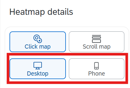
Device
By switching between the desktop and phone icon, you can view the individual Heatmap user reports for each of those devices.
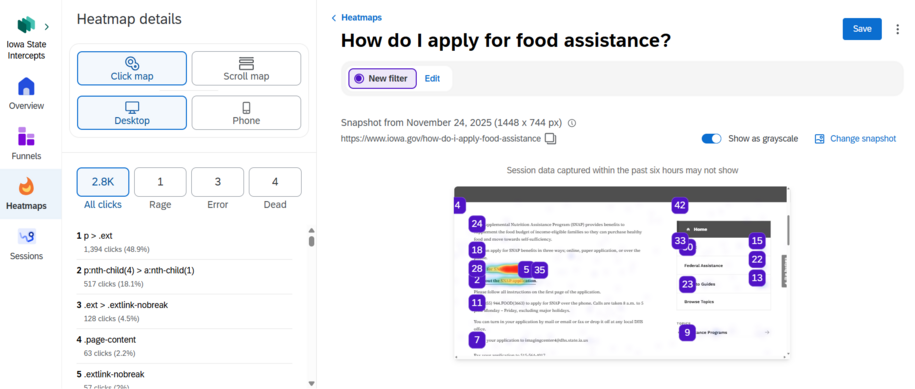
Click Map
Use this feature if you want to see all the places users are clicking and the number of users clicking. Click maps help to better understand if improvements are needed for the placement of images or links.
When you hover your mouse over the purple numbered icon, you'll see a pop up that will show the number of clicks. It will show which were errors, dead clicks, or rage clicks.
For example, when you hover your mouse over the number 25 purple icon, the popup window in the far-left side menu shows the number of clicks.

When you select one of the numbers in the list in the left side Click map menu, you'll see a replay button to watch a video of user mouse movements.
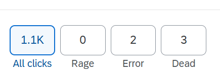
All clicks
All clicks gives you a full picture of every click users make on a page. This feature is especially useful for seeing which links or sections on your page receive the most engagement. This can help you see whether important Call to Action links or buttons are being noticed or if users are getting distracted by less relevant links.
Rage Clicks
Rage clicks highlight moments when users repeatedly click on the same element out of frustration. This feature is valuable for spotting broken functionality, confusing design, or slow-loading elements. By analyzing rage clicks you can uncover areas where users expect something to work but it doesn’t, such as a disabled button or an unresponsive link, and take action to reduce frustration.

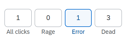
Error Clicks
Error clicks track interactions that trigger error messages or failed actions. This feature helps identify technical problems like form validation issues, login failures, or broken scripts. By monitoring error clicks, you can quickly detect barriers that prevent users from completing tasks and prioritize fixes that improve reliability and trust in your site.
Dead Clicks
Dead clicks reveal when users click on elements that appear interactive but don’t perform any action. This feature is useful for uncovering misleading design choices, such as images or text styled like links but not actually clickable. By addressing dead clicks, you can eliminate confusion, streamline navigation, and ensure users spend their effort on meaningful interactions.

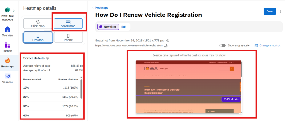
Scroll Map
The Scroll map feature is great for agencies who want to see the average percentage of how far users scroll on a selected page tag.
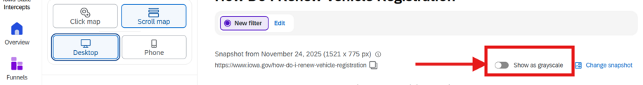
Show as Grayscale
This button displays scroll activity in grayscale shading, making it easy to see which sections of a page receive the most or least attention. Use this if you need additional visual help in deciding whether important information needs to be moved higher or reformatted for better visibility.
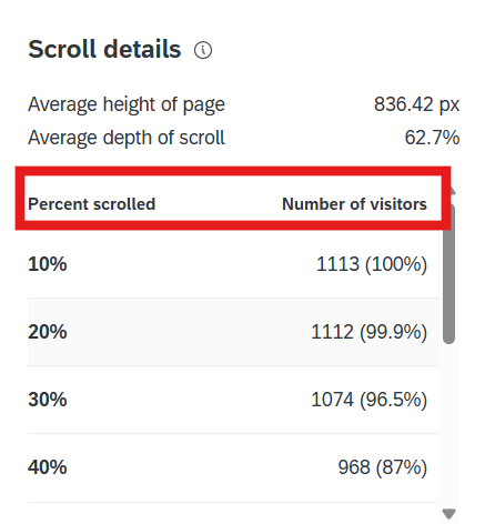
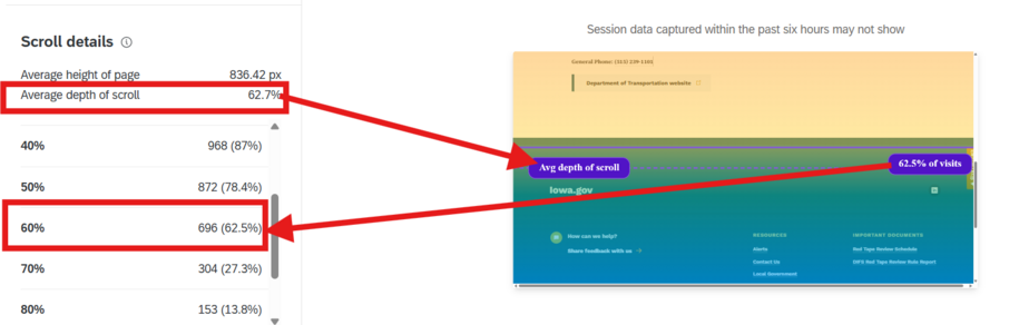
Scroll Details Average Height
This shows the average height users reach when scrolling down a page. It’s useful for understanding how far visitors typically go before stopping. This can be used as an identifier to determine if important content is placed too low. You can then adjust the placement so the key information appears within the range most users actually view.
Percentage of the Average Depth of Scroll
The Average depth of scroll shows the percentage of the page that users typically scroll through. It can also help show the overall engagement with any pages on your site that may have a lot of content or sections. You can see whether users are consuming the majority of a page or abandoning early. This can help you decide about shortening text, breaking content into sections with a table of contents, or using different microcontent to highlight Call to Actions sooner.
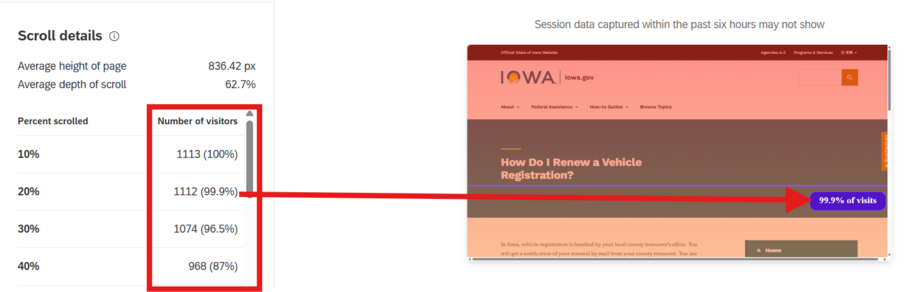
Number of Visitors Per Percent Scrolled
The Number of visitors per percent scrolled section within the Scroll details window shows how many visitors reach each percentage level of the page. It's a faster way to see a breakdown of audience engagement at different depths.
You can use this to help track visitor counts per scroll percentage. This can help to pinpoint exactly where users lose interest or what sections need to have microcontent, images, or Call to Action buttons. These additions or different text formatting can help guide users to important information if they aren't scrolling down far enough.