On this page...
WYSIWYG Toolbar Editor
The What You See Is What You Get (WYSIWYG) toolbar is included in majority of content types like Basic pages and Book pages. Some of the functions within the WYSIWYG bar will be limited for other content types and microcontent like News pages and Location pages.

Many of the icons within the toolbar are similar to those you will find in Microsoft Word or Google Docs and also includes tools that work as a fast pass to uploading media or special embeds to your website's Library as well as how to embed previously created content into a page.
Hovering your curser over the toolbar icon shows a tool tip with the icon's name to give you a better idea of what each icon is for.
Back to topHeadings
Basic pages should include hierarchical Heading structure. You can find Heading styles listed under the Paragraph dropdown in the toolbar. Content writers can select the Heading level for a highlighted portion of text.
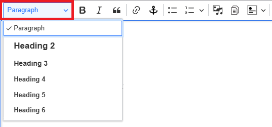
Heading hierarchy
H2 headings indicate major topics within the overall page. These are also used if you have selected the Display on this page... table of contents checkbox. H3 headings indicate subtopics contained under an H2 heading. H4 headings indicate subtopics contained under an H3 heading and so forth for H5 and H6 headings. Headings should be in a hierarchical order - H1, H2, H3, H4, H5. In the content editor, you can view and hover over each of the bolded words to confirm H4 follows an H3 and not immediately after an H1 or H2.
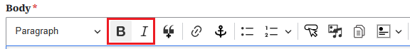
Back to topBold and italics
Bold and italic text should never be used to indicate headings. Bold text should be used to emphasize specific information the user needs to know. Use italics for sources of information or titles of complete works, such as books, films, journals, or music pieces.
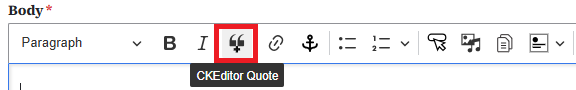
Block quotes
A block quote is a quotation formatted as a separate block of text, indented from the left margin and placed on a new line. When using the block quote styling from the WSYIWYG menu, you do not need to add quotation marks. Do not use block quote just for indentation.
Sunshine is delicious, rain is refreshing, wind braces us up, snow is exhilarating; there is really no such thing as bad weather, only different kinds of good weather.
Back to top
Creating links and anchor links

A Linkit tool allows you to go to a different webpage or document. An anchor link allows you to jump to a specific spot within the same page.
Learn how to create a link | Learn how to create an anchor link
Back to topBulleted and numbered lists
Bulleted lists and numbered lists must have more than one item. The list format is only used for items that are related to each other.
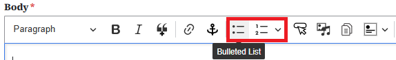
You can use the tab key to quickly create indents or outdents for your list if you want to use the different alphabetical and roman numeral bullet list styles:
- Peaches
- Oranges
- Pears
- Grapes
- Alabama
- Alaska
- Colorado
- Summer
- Spring
- Fall
- Yellow
- Red
- Blue
Having paragraphs of long text using the list format is an example of invalid list usage. Below is an example of using the list feature that is not following best practice:
- Friday, March 21, 2025
- This is a paragraph of some text about U.S. History. This is a paragraph of some text about U.S. History. This is a second paragraph about mathematics.
Indentation
Similar to Microsoft Word or Google Docs, the indentation icon with the right facing arrow will indent your text four character spaces to the right. This also works within a table cell. To remove the indentation, select the text and select the left facing indentation icon with the left facing arrow.
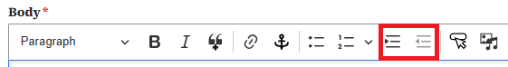
The indentation icon also works to indent a subset of a bulleted or numbered list.
- one
- two
- three
- three1
- three2
- three3
Call to Action (CTA) Button
The Call to Action (CTA) icon allows you to place a button within your page and type your own text within the button and provide a link for the button.
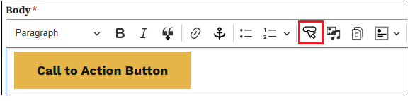
Begin by selecting the Call to Action icon. Once selected, you'll see a pop-up box where you'll add the link the button will go to, along with the text for within the button. The required URL field works the same as the Linkit tool. To link to a page on your own website, start typing in the title of the page to link to. Once you find the title in the responses, select that title for your URL. To link to a page on another website, you can paste the URL in that field. Select Save, and the button will be added to your web page.
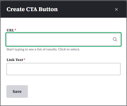
Image and video embeds
Images and videos can be added to the Media Library and embedded in Basic pages. Size and display options include full-screen, small left-justified, small centered, and small right-justified. Text will wrap around the small sized images.

Full screen image or video
To embed a full screen image or remote video, click the Insert from Media Library icon in the WYSIWYG toolbar.
From inside the pop-up window that appears, you can either select Image or Remote video. Scroll down and select from the Media Library if the image or media has previously been uploaded. This will embed in its full screen state. If the image or remote video hasn't been uploaded, you'll have the option to upload the image or add the URL for the remote video.
Learn more on how to work with the media library within our documentation.

Small left-justified image or video

To embed a small left-justified image or video, click the Insert from Media Library icon in the WYSIWYG toolbar.
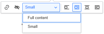
Select the desired image and embed. This will embed a full-screen image or video. You'll need to click on the image to change its size and alignment. Clicking the image or video will open a pop-up menu. Select Small from the size choices and the Left alignment choice.
Once embedded in the page, the media item can be positioned by dragging and dropping where desired within the content.
Small centered image or video
To embed a small, centered image or video, click the Insert from Media Library icon in the WYSIWYG toolbar. Select the desired media item and embed. This will embed a full-screen image. You'll need to click on the image or video to change its size and alignment.
Clicking the image or video will open up a pop-up menu. Select Small from the size choices and the Centered alignment choice.
Once embedded in the page, the image or video can be positioned by dragging and dropping where desired within the content.
Small right-justified image or video
To embed a small right-justified image or video, click the Insert from Media Library icon in the WYSIWYG toolbar. Select the desired image or video and embed. This will embed a full-screen image or video. You'll need to click on the image or video to change its size and alignment.
Clicking the image or video will open up a pop-up menu. Select Small from the size choices and the Right the right alignment choice.
Once embedded in the page, the image or video can be positioned by dragging and dropping where desired within the content.
Back to topDocuments
Documents like PDFs and Excel files can be uploaded and stored in the Media Library as individual files. You can link to them from your web pages, or you can embed links to them within your page. You can also make Listing pages and Link Collection lists using them.
Learn how to manage documents in the Media library and how to embed on a Basic page.

Accordions
Accordions are a great way to display information by topic when the user may only need select information. You can embed the Accordion from the microcontent library when you select the Insert from Component icon on the right of the document embed icon dropdown in the WYSIWYG toolbar.
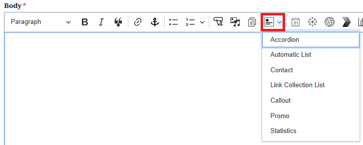
An embedded Accordion within the edit section of a Basic page will appear like a grey box.

But when viewed on the live page, it will look like a typical Accordion with the list of titles and arrows for users to open and read the dropdown fields that appear.
Back to topAutomatic List
Automatic Lists are a great way to add Contacts, How-Do-I Pages, Basic Pages, Events, Locations, Documents, or News that are updated frequently or have a large number of items. To create an Automatic List, select Content > Add Microcontent > Automatic List from the Content menu.
Automatic Lists can be filtered by topic, type, area served, and/or Division/Section.
Once you've created the Automatic List, you can embed it into a Basic Page by clicking on the Insert from Component Library button in the toolbar and selecting Automatic List. This will open up a dialogue box so that you can select the desired Automatic List from the Library or create a new one.
Contact
Embedding a Contact into a Basic page is a great way to help users connect with vital personnel who can provide assistance or information as needed. To create a Contact, select Content > Add Microcontent > Contact from the Content menu.
Once you've created the Contact, you can embed it into a Basic page by clicking on the Insert from Component Library icon on the toolbar and selecting Contact. This will open a dialogue box where you can select the desired Contact from the Library or create a new one.
For example, if I wanted users to contact Nikki Flores when they have a question about creating content on their new site, first create, then embed, a Contact for Nikki Flores.
Back to topLink Collection List
A Link Collection List is a great way to present a collection of related links that won't be updated frequently. To create the Link Collection List, select Content > Add Microcontent > Link Collection List from the Content menu.
Once you've created a Link Collection List, you can embed it into a Basic page by clicking on the Insert from Component Library button in the toolbar and selecting Link Collection List. This will open up a dialogue box so you can select the desired Link Collection List from the Library or create a new one.
For example, the following Link Collection List provides users with a collection of resources related to creating websites.
Back to topCallout
A Callout can add extra information or highlights to your website content. It's ideal for providing context, emphasizing key points, or offering additional details.
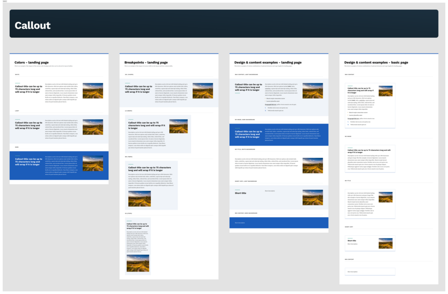
Learn how to create and embed Callouts on your website.
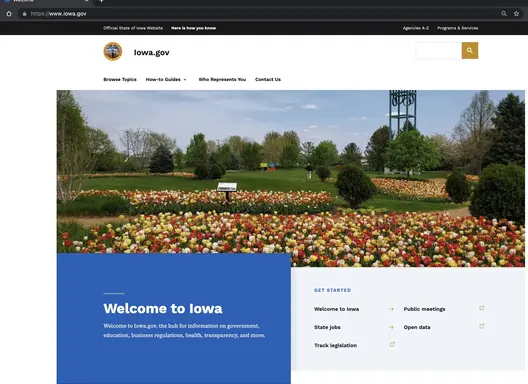
Back to topPromo
A Promo is a great way to emphasize or highlight content that you want users to visit. A Promo can feature a News Page, a Landing Page, a How Do I Page, a Location, a Contact, or Event. To create the Promo, select Content > Add Microcontent > Promo from the Content menu.
Once you've created a Promo, you can embed it into a Basic page by clicking on the Insert from Component Library icon in the toolbar and selecting Promo. This will open up a dialogue box where you can select the desired Promo from the Library or create a new one.
For example, the following Promo highlights information about the progress of the Governor's Digital Transformation Initiative.
Iowa agencies move onto the updated platform
Sites are converting on a regular basis to a unified platform, sharing architecture, colors and styles, and approach.
Statistics
A Statistics microcontent block is a great way to highlight your agency's achievements and contributions to the success of all Iowans. To create the Statistics block, select Content > Add Microcontent > Statistics from the Content menu.
Once you've created a Statistics block, you can embed it into a Basic page by clicking on the Insert from Component Library icon on the toolbar and selecting Statistics. This will open up a dialogue box where you can select the desired Statistics from the Library or create a new one.
For example, the following Statistics block highlights the number of sites that have been updated to the new platform. Keep in mind that this information does not auto-update. Someone will need to manually update the Statistics block once new sites have been migrated to the new platform.
Back to topThird-party embeds
- Google Calendar - You can create Google Calendars for meetings, events, and much more. A calendar is an easy at-a-glance view of event.
- Tableau - Embed visualization (private and public servers) inside a Basic page
- ArcGis - Map or app inside a Basic page
- CrowdRiff - To embed a CrowdRiff map or image, first create that map or image in CrowdRiff. Once it's created, you'll be able to copy the CrowdRiff ID, and add that to the Media Library to embed on your website.
- Data & Insights - (Tyler Technologies, formerly known as Socrata) embed a visualization inside a Basic page
- Power BI - Inside a Basic page
- Qualtrics - Embed a survey or form on a Basic page
- Looker Studio

Tables
To embed a table, select the Table button from the editor's menu.

Tables are a great way to display information in an easy-to-read format.
| Purchaser | Apples | Oranges |
|---|---|---|
| Bob | 5 | 3 |
| Abigail | 4 | 13 |
Additional guidance on adding Tables and Table properties
Back to topHorizontal Rule
You can add a horizontal rule to your page by simply clicking the Horizontal rule icon. It will appear as a grey line at about 90% of your page width.

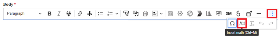
Special characters
You can locate the special characters submenu within the show more items section. This can be found by selecting the three vertical dots at the far-right end of the WYSIWYG bar.

The Special Character (upside down horseshoe) icon will bring up a Windows library of symbols for you to choose from:
- Latin letters
- Numbers (including fractions)
- Currency symbols
- Punctuation Text
- Arrows
Mathematical operators
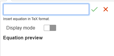
You can use the Insert math icon if you need to embed equations on your site. When you select the Insert math icon it will display a window to add your mathematical equations.
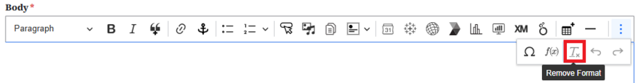
Remove hidden text formatting
Copied text from Microsoft Word can sometimes retain hidden formatting. Once you’ve pasted it to your web page, you can highlight the text and click the Tx symbol on the WYSIWYG formatting toolbar to remove hidden formatting.
Another tip when pasting from Microsoft Word to your web page is to place your cursor where you want to insert the copied text and right click your mouse. Choose Paste as plain text to avoid carrying over any unwanted formatting.
Back to top